
Tuesday, March 26, 2013
Keane's "Perfect Symmetry"
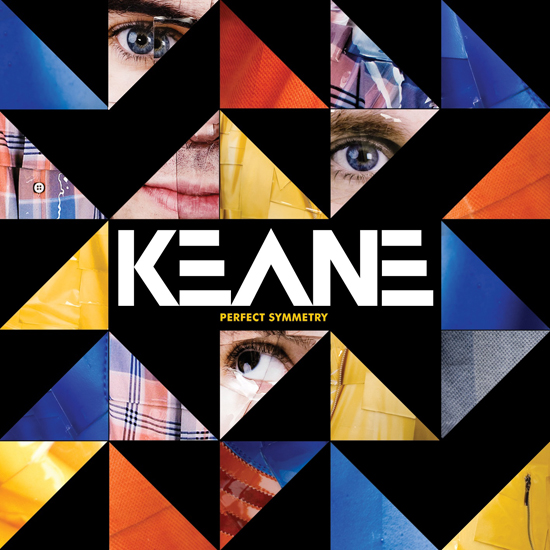
I spent my whole morning working on my campaigns for P2 with my Spotify set to play anything by Keane. This was how I discovered their album Perfect Symmetry. I have a thing for geometric design, so I was immediately intrigued by this cover. I love the use of triangles and how they each show a different part of an image, almost like a puzzle. The font choice for "Keane" is perfect with the geometry of the background, and I like the the album title is smaller and simpler beneath it to balance everything out. The aptly named album title reflects the design style, further showing how every aspect, from the font to the art to the album name, all complement eachother for "perfect symmetry."

OneRepublic's "The Good Life"
OneRepublic release the single "The Good Life" ages ago, but the art that came out with the single is still noteworthy. The plain black background makes it easier to draw attention to what appears to be splatters of paint running down the middle. The bright colored cluster contrasts well with the slightly dulled down greener cluster below it. The title is off center and the color of the font is somewhere between the bright and dull paint clusters, giving the impression of a gradual change.

Tuesday, March 19, 2013
Coldplay's "Mylo Xyloto" Continued
To add to my last post on Coldplay's Mylo Xyloto, I have attached another version of the album art to compare. The same vibrant graffitti image is used again. However, in this album it makes up the letters instead of the background. Furthermore, only two letters are used, giving it a simpler look than the design in my previous post. The foreground appears to be a metallic silver color with a paperlike texture and dark shadows where "MX" is cut out, giving the album a three-dimensional feel. I really like the look of this design, especially how the complicated graffiti art is balanced out by the simple silver foreground of negative space. It was hard to choose but I think I like this version better than the one in my previous post because it is slightly simpler and easier to read.

Coldplay's Mylo Xyloto
Coldplay's Mylo Xyloto album has amazing art. The background is incredibly colorful and vibrant, composed of what appears to be grafitti art. The grafitti collage makes for an interesting background full of interesting shapes and designs, as well as saturated colors. The album title is spaced over three lines in the center, and I really love the choice of font. The letters are outlined rather than filled in, allowing us to see more of the background grafitti art. The choice to use bubble letters was perfect because it allows for more of the art to be seen, and the white outline contrasts nicely with the background so the album title is readable and and works well with the background colors


Friday, March 15, 2013
Modest Mouse: We Were Dead Before the Ship Even Sank
I wrote not too long ago on one of the Modest Mouse album designs, but I am now using this post to recognize another. We Were Dead Before the Ship Even Sank utilizes several different design elements. The background is a deep blue with distressed edges to give it an aged look, and the focus is on a parachute with an anchor attached. This image is interesting because it represents sinking and flying simultaneously, implying the struggle of being stuck in the middle of a difficult situation, something everyone can relate to. The font choice for "Modest Mouse' is more decorative, while the album title is simpler and sans serif. The two contrasting types balance each other out nicely, and further emphasizes how the album art represents the struggle between simple and complicated, sinking and swimming, new and old, etc.


Flying Lotus' "Cosmogramma"
Flying Lotus' "Cosmogramma" has a very interesting design. This one uses a vanishing point in the center of a a circle to create lines radiating out from the center of it, creating an interesting perspective. It could be interpreted as a sun almost, and the round objects off to the side give the impression that the design is a minimalist illustration of outer space. With the lack of color, the art is simple yet interesting. It has a very outer-spacey feel to it, but I think it has a unique aspect and a good end result.

Wednesday, March 6, 2013
Starfucker album art
I'm crazy obsessed with Starfucker's album art right here. Here's another unique perspective piece, this time a two point perspective with both vanishing points on the art. Then, each side is segmented into different shapes of all different colors. I don't think a color repeats once here, but each has similar ones used more than once. The font is also interesting and complements the rest of the art well. I like that they didn't keep it simple to contrast against the design.

Muse: The Resistance
This is definitely my favorite album art that Muse has ever done. Another interesting take on perspective as was done with the Strokes album I wrote about in my last post, except this one utilizes a different shape and appears to have a vanishing point in the middle instead of off to the side. The colors all work well together, with the lighter/ brighter ones towards the bottom, giving the impression of a light source. Earth is at the center of the vanishing point, and there's a pathway extending from it with a silhouette of a person, but we can't tell if he's walking towards or away from Earth. Overall a really cool work of album art.

Subscribe to:
Posts (Atom)